Playful by nature.
Clear by design.
A warm, spacious visual language for young learners and busy teachers. Friendly shapes, purposeful color, and simple choices help every adventure feel approachable.
Color with a little breathing room.
Cream forms the canvas, forest ink keeps text clear, and orange points to the next action. Soft tints add variety without competing with the learning task.
Warm cream
#F7F8F2Forest ink
#243C32Friendly orange
#F08A5DLeaf green
#49715CSage
#E7F0D8Lavender
#EEE7F7Butter
#FFF1C7Sky
#E6F0F6Type that feels like a friendly voice.
Bricolage Grotesque gives headings their personality. Nunito Sans keeps instructions, descriptions, and labels easy to read.
Small steps.
Big discoveries.
Expressive headings with close letter spacing and generous space around them.
Read the clue. Try an answer. Discover something new.
Plain instructions, comfortable line lengths, and a steady visual hierarchy help learners focus on one thing at a time.
An obvious next step.
Buttons have clear labels and roomy touch targets. Navigation stays familiar, and keyboard focus remains visible.
A soft frame for useful content.
Cards use rounded corners, quiet borders, and gentle shadows. A subtle background can group information without making every element demand attention.
Room to read
A white surface lets the words do the talking.
Room to wonder
A little color gives related content a shared home.
Room to try
Encouragement stays warm, specific, and easy to understand.
Little details that help.
Labels pair concise text with gentle tints. Lucide icons support the words, while difficulty always has a written label.
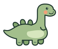
Curiosity has a mascot.
Meet Sauro: rounded leaf-green shapes, an orange cheek, and a curious smile. His whole silhouette welcomes you in our logo and browser icon, and cheers on every little try across the site. Clear instructions keep the learning in focus.